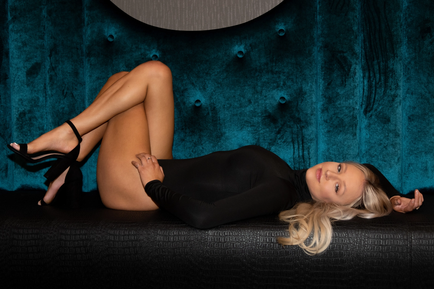
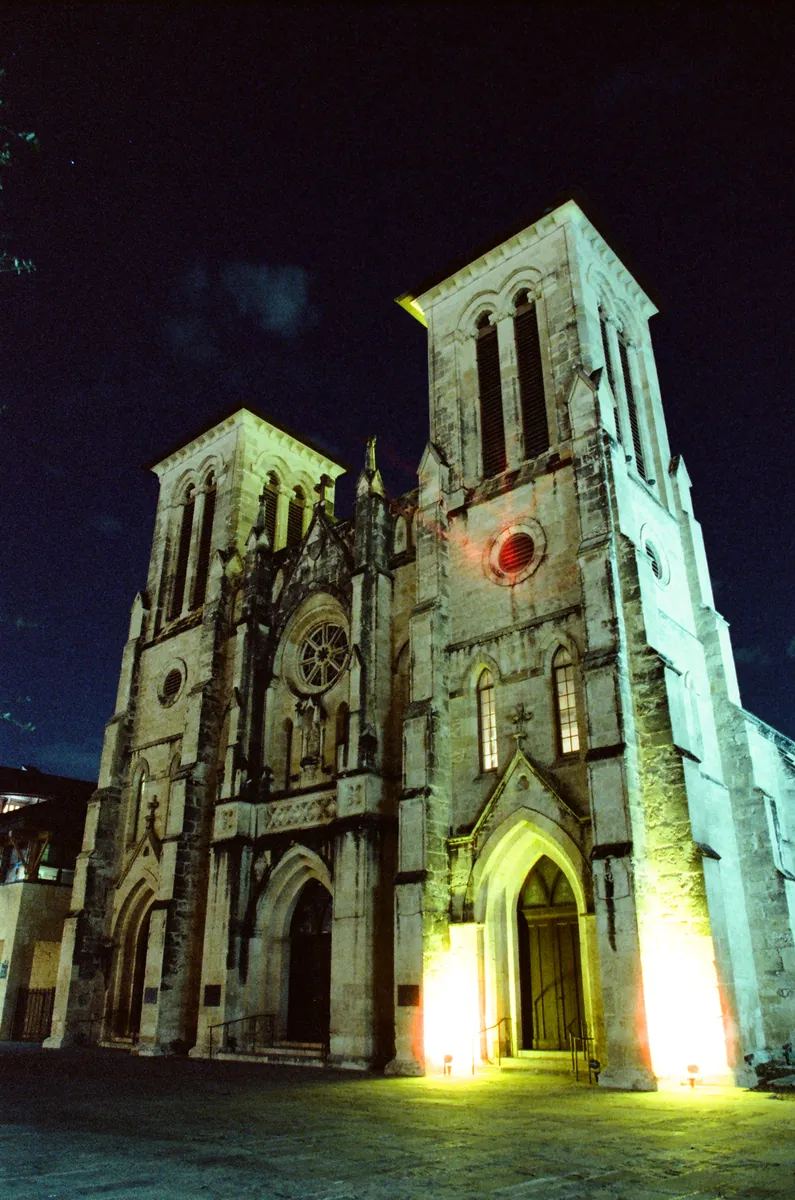
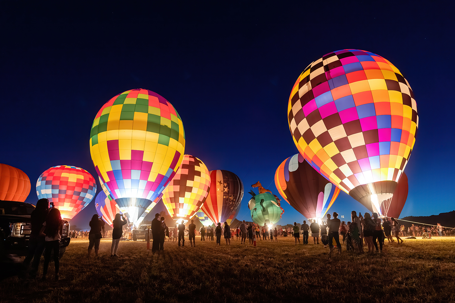
I do photograph in color, but I treat it carefully. Color is powerful — sometimes too powerful. The human eye is drawn to it before anything else. A bright red object in the corner of a frame can steal attention from a person’s face. A vivid blue sky can overpower the emotion of a quiet moment. Viewers often think they are looking at a subject, when in reality they are reacting to color contrast. If it is not controlled, color stops serving the photograph and starts competing with it.
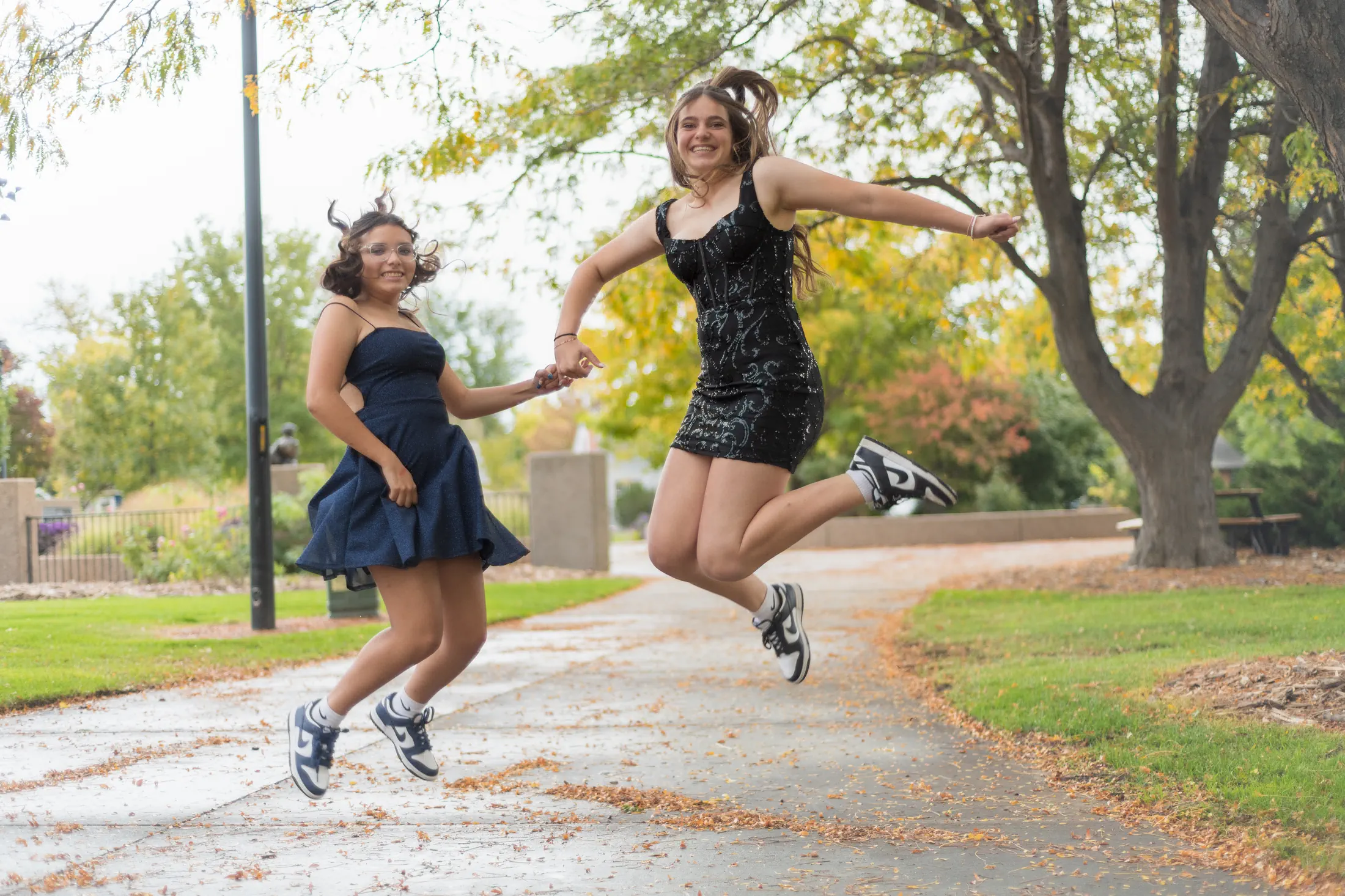
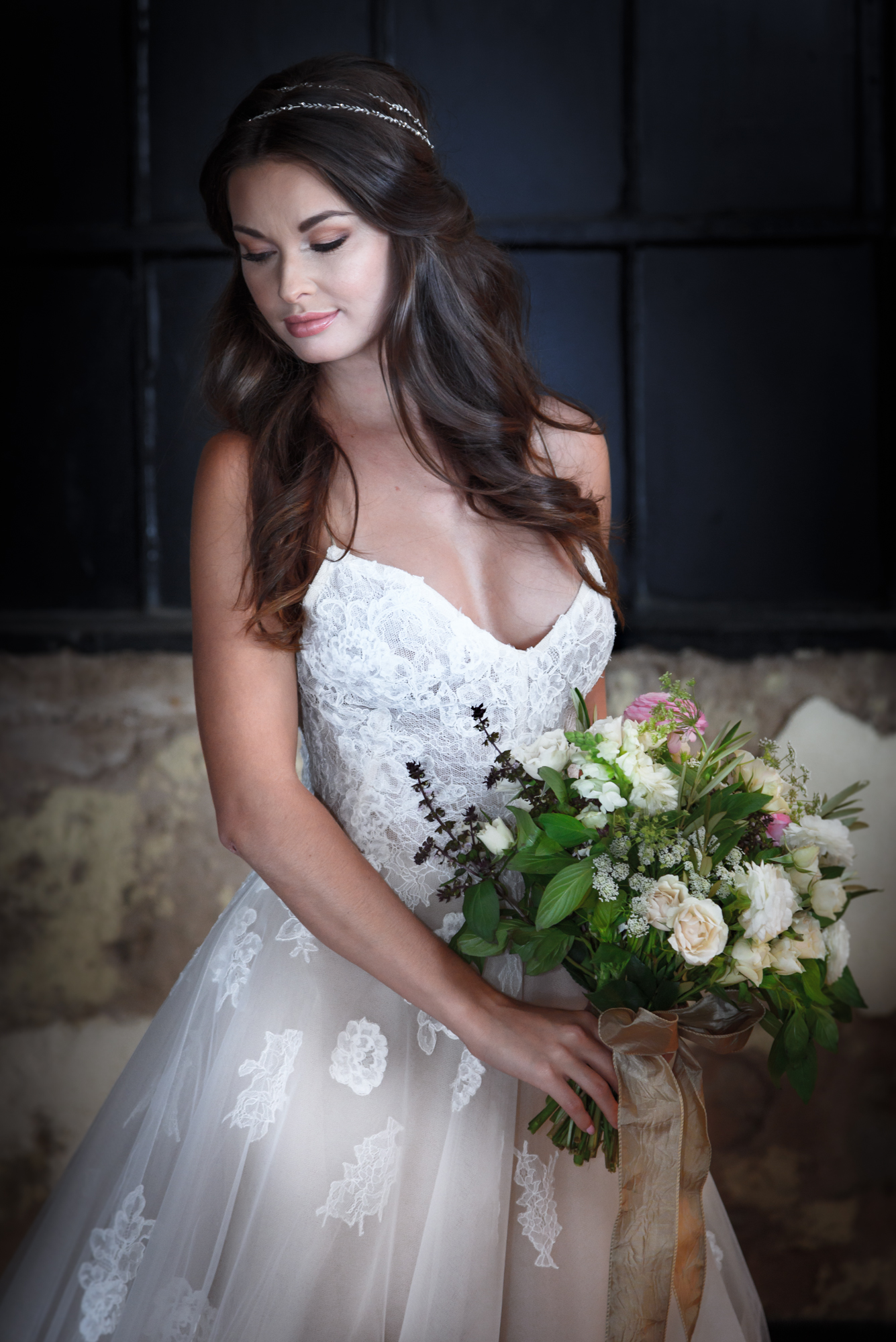
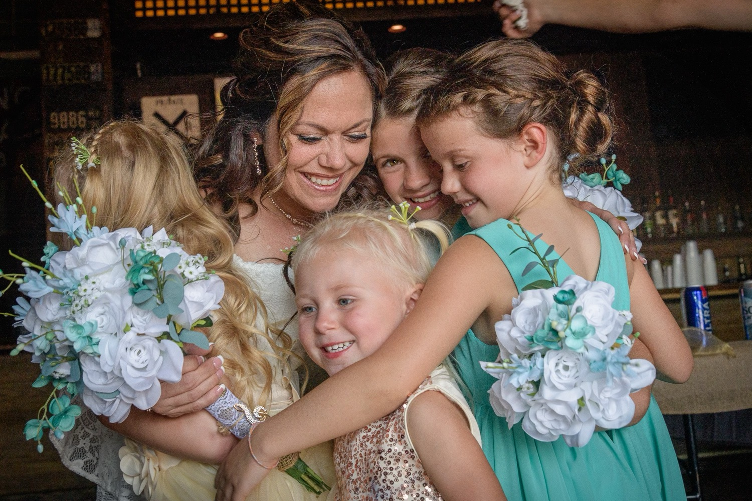
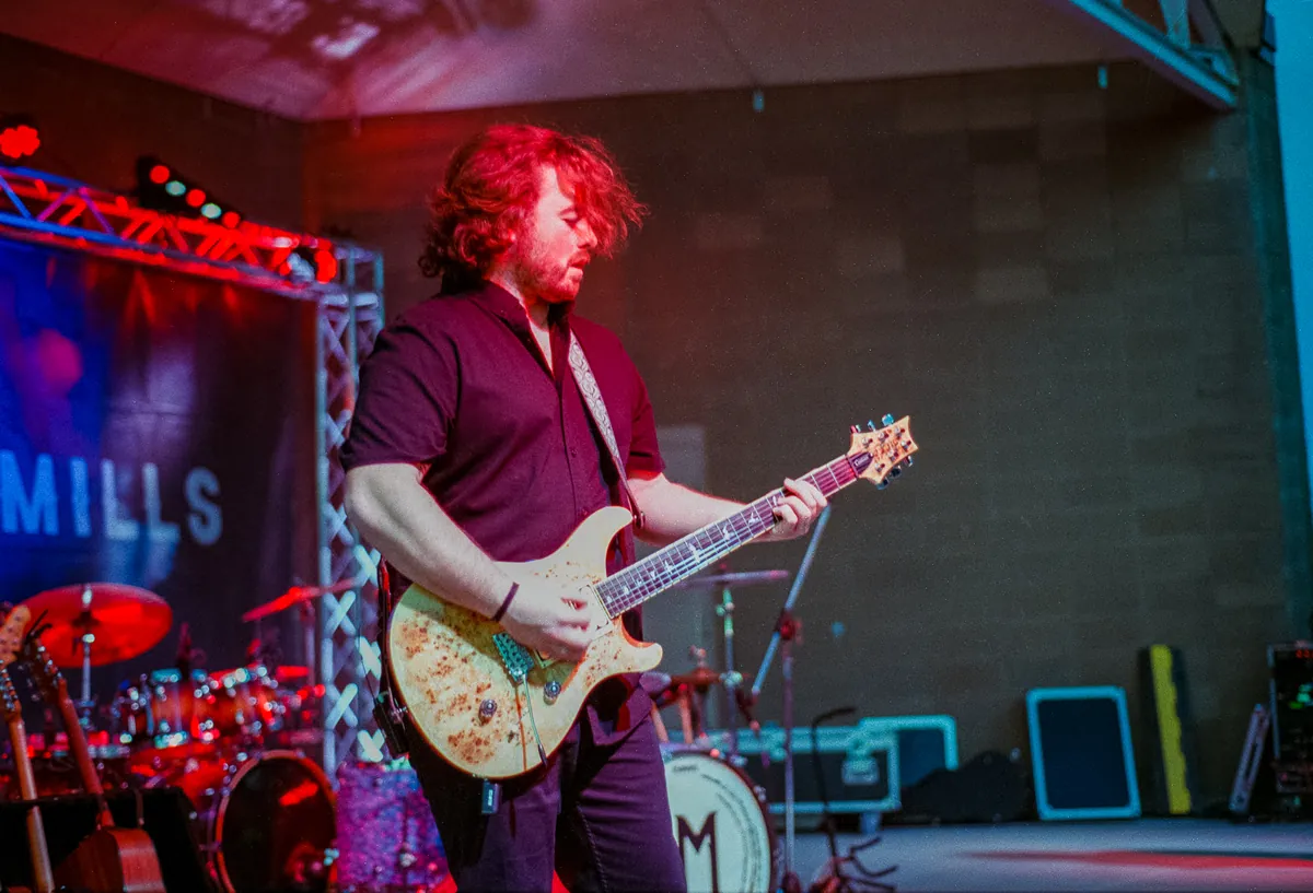
I see this most often during events and weddings. Decorations, clothing, and lighting are designed to be vibrant, but the story is not in the decorations. The story is in people — expressions, interactions, and relationships. When color dominates, the viewer remembers what the room looked like but not how the moment felt. A photograph should not become a catalog of objects. It should guide the eye to meaning. That requires restraint and awareness before the shutter is pressed.
So I don’t reject color; I manage it. I compose with it the same way a painter chooses a palette. I look for harmony instead of intensity. I position subjects against backgrounds that complement rather than compete. Sometimes I wait for a person to step into softer light so colors quiet down and the subject emerges naturally. Other times I deliberately use a single strong color to anchor the frame while the rest of the scene supports it. The goal is not brightness — the goal is direction.
When used intentionally, color becomes storytelling. Warm tones can convey closeness and comfort. Cooler tones can suggest distance, reflection, or solitude. Muted palettes can make a moment feel timeless, while contrasting colors can create energy and movement. I do not push color heavily in post-processing to manufacture drama. Instead, I refine what already exists so the photograph remains believable. The image should feel seen, not engineered.
In this way, color can actually make an image stand out as art. Not because it is loud, but because it is organized. When colors work together, the viewer’s eye moves through the photograph in a deliberate path — from the subject, to the environment, and back again. The photograph holds attention instead of scattering it. The story becomes clearer because nothing inside the frame argues with anything else.
I think of color as a language. Used carelessly, it becomes noise. Used thoughtfully, it becomes emphasis. My job is not to eliminate color, nor to let it run wild, but to guide it so the photograph communicates what the moment truly was. When it works, viewers do not notice the color first. They notice the feeling — and only afterward realize color helped carry them there.